
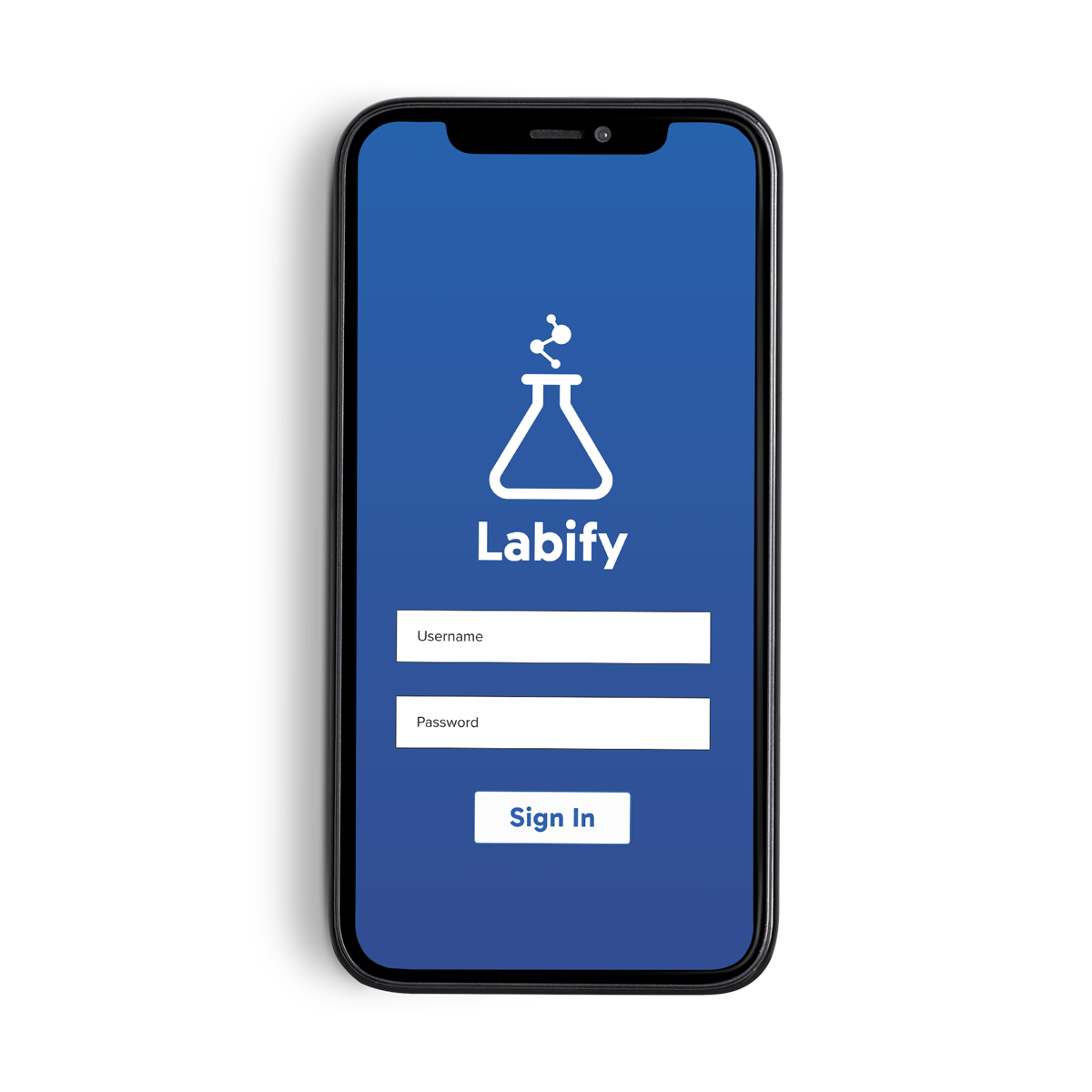
Labify
Role Product Designer
Skills Prototyping, Visual Design, UX/UI
Tools Figma
For a team building, in-person activity, I had the idea to lead the team in an “Agency” style activity. In two groups, I tasked the teams with crafting a marketing story for a fake 6–8 Science App focused on Lab classwork. To give them something to work from, I decided to build out and design the app, “Labify”.
Before starting my work, I wanted to check out a few existing apps in a similar field to see how they function and review what their reviews are saying.
• For Nerdish: Most reviews applauded the apps “bite sized chunks” and the range
of options to explore. Some critiques, were the somewhat “low researched”
articles.
• Periodic Table: People love the ease of use and clean design. They love being able to easily search a specific element.
Customers reviewing also mentioned submitting feedback for improving their experience (e.g. adding a zoom, fixing some mislabelled elements) and the developers responding and improving those situations.

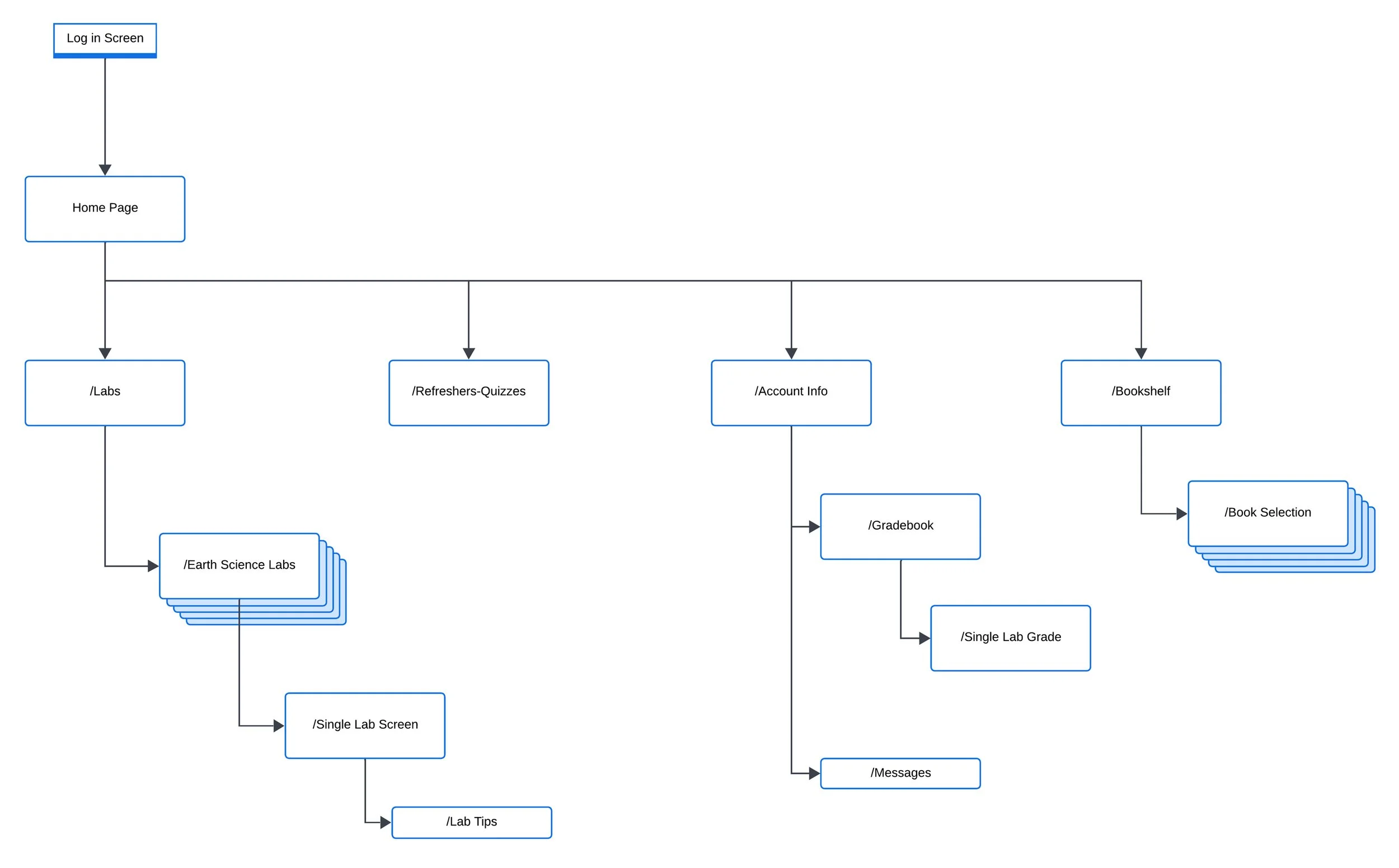
After doing my “competitor” analysis, I knew I wanted to make some specific structure choices for Labify. Mainly, I wanted a clean and clear home page for students to rest at. No need to overwhelm people with information right away, even when the main goal of the app is in-class/at-home Lab Assistance.
So, I went through building out the app structure with that in mind.
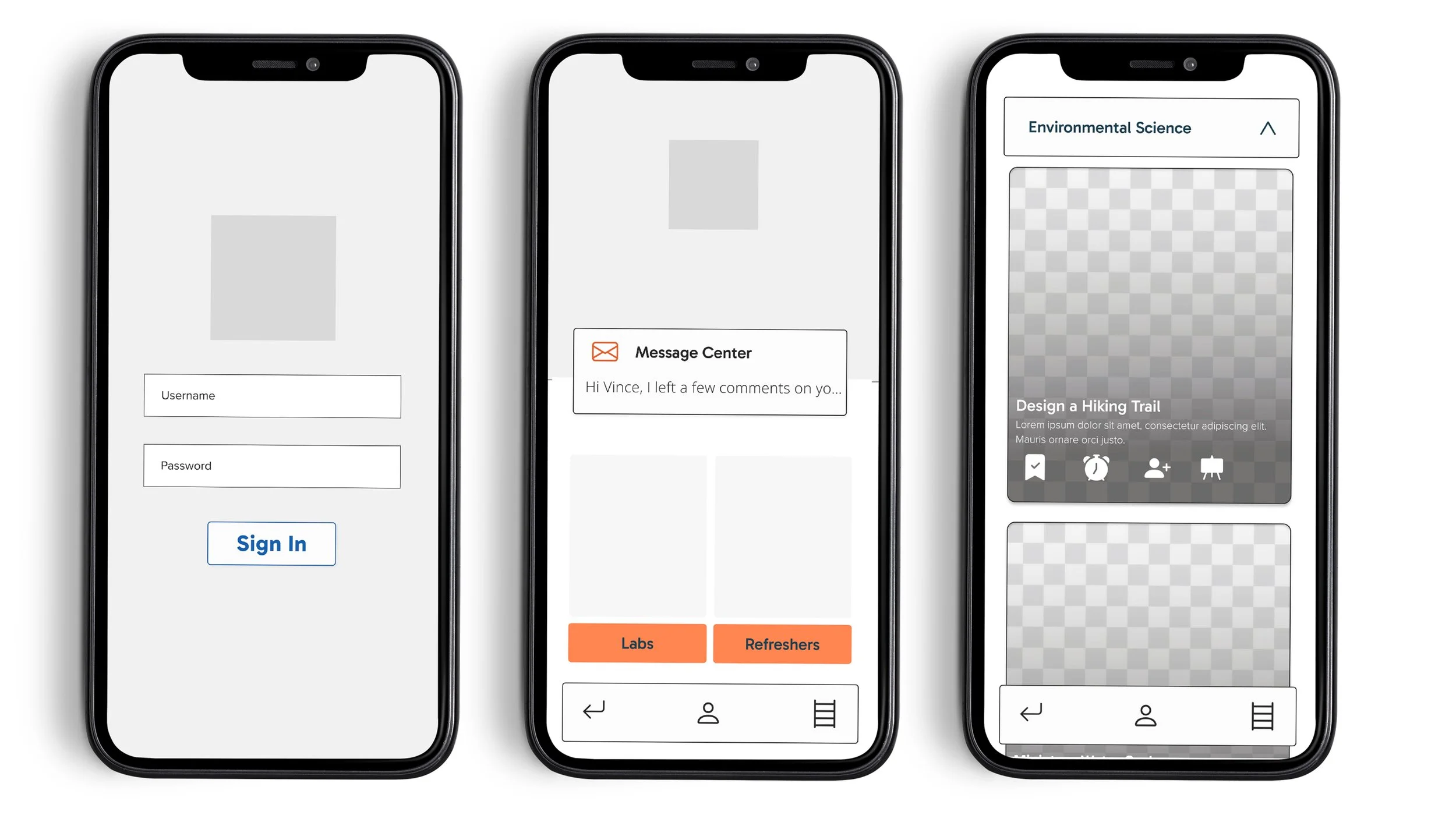
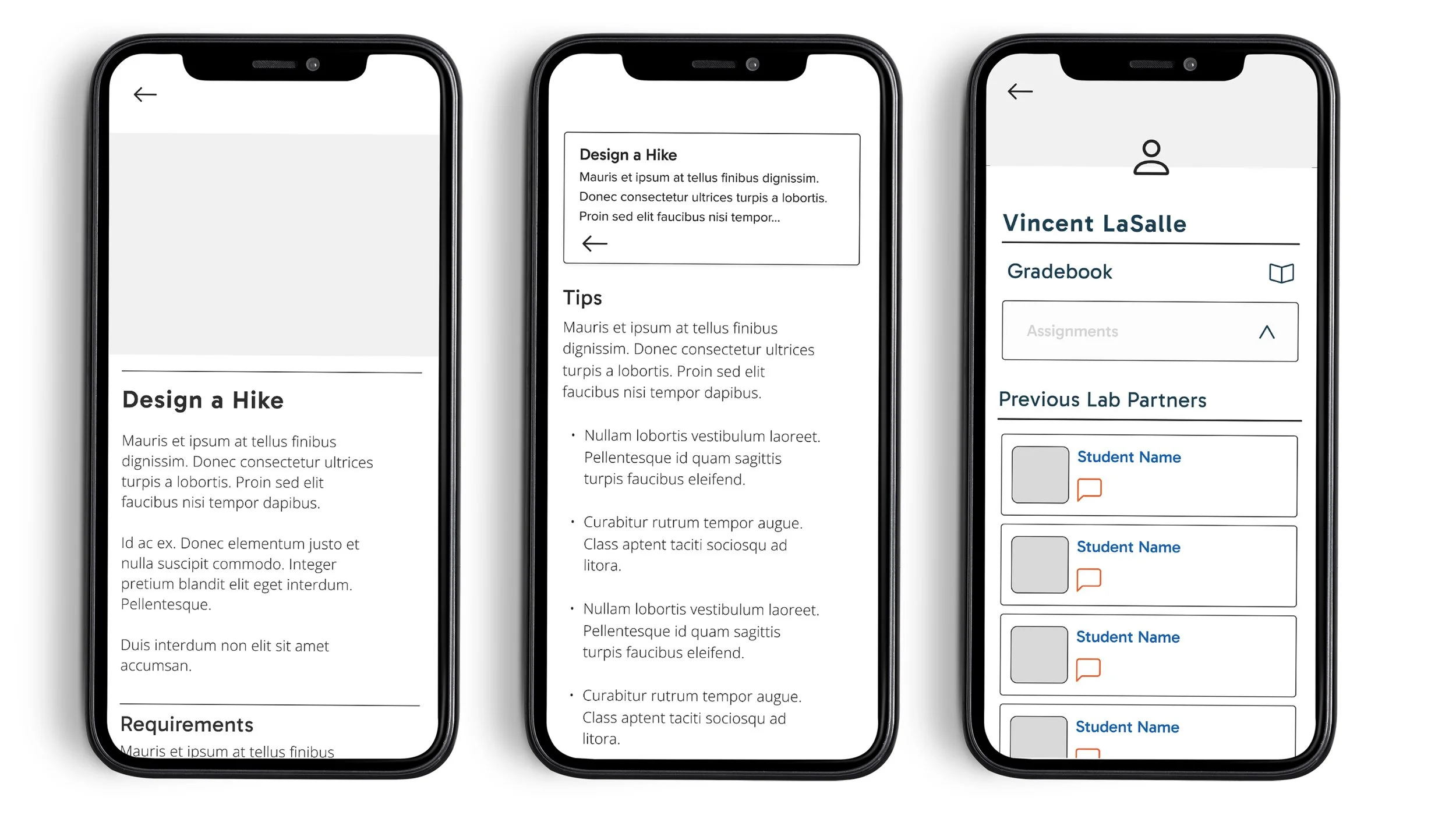

To get a better look at Labify, please feel free to look around my Figma file and experience the demo prototype. I have removed images from the design that were real product shots or “students”, those images have been left grayed out.
Thank you!