Communities | Re-Design
Support Orly Lipset, copywriter
Skills Visual Design & UX/UI
Tools Figma, Illustrator, Photoshop
Role Lead Designer
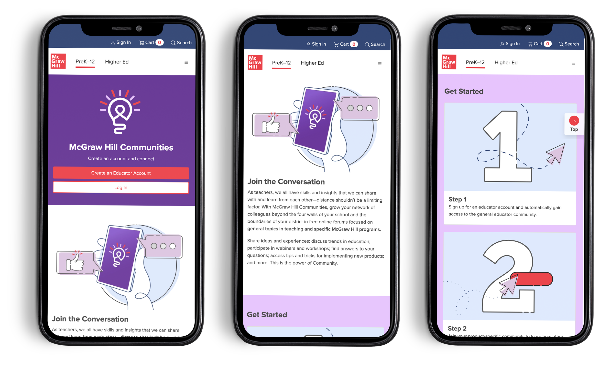
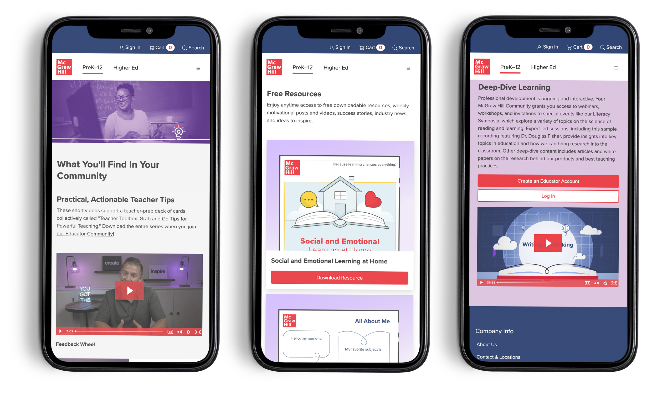
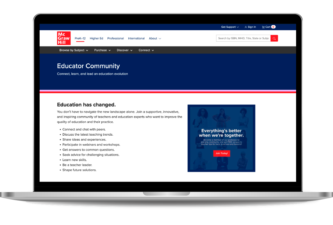
Our partners in charge of the “Communities” experience, wanted us to re-design their marketing site and craft a clearer story. As it stood, there were two marketing pages, “Product Communities” and “Educator Communities” even though they were all part of a single experience. So, we were tasked with combining that content and providing clear instructions on how to join “Communities” and which ones were relevant to which customer.
Customers were getting confused about the sign up process
Educator Communities and Product Communities felt like two completely different experiences.
There was no clear way for users to log in, if they hadn’t bookmarked the Communities log in page.
Users were joining every product community regardless of if they were active users.
Problem Statements
Initial Structure
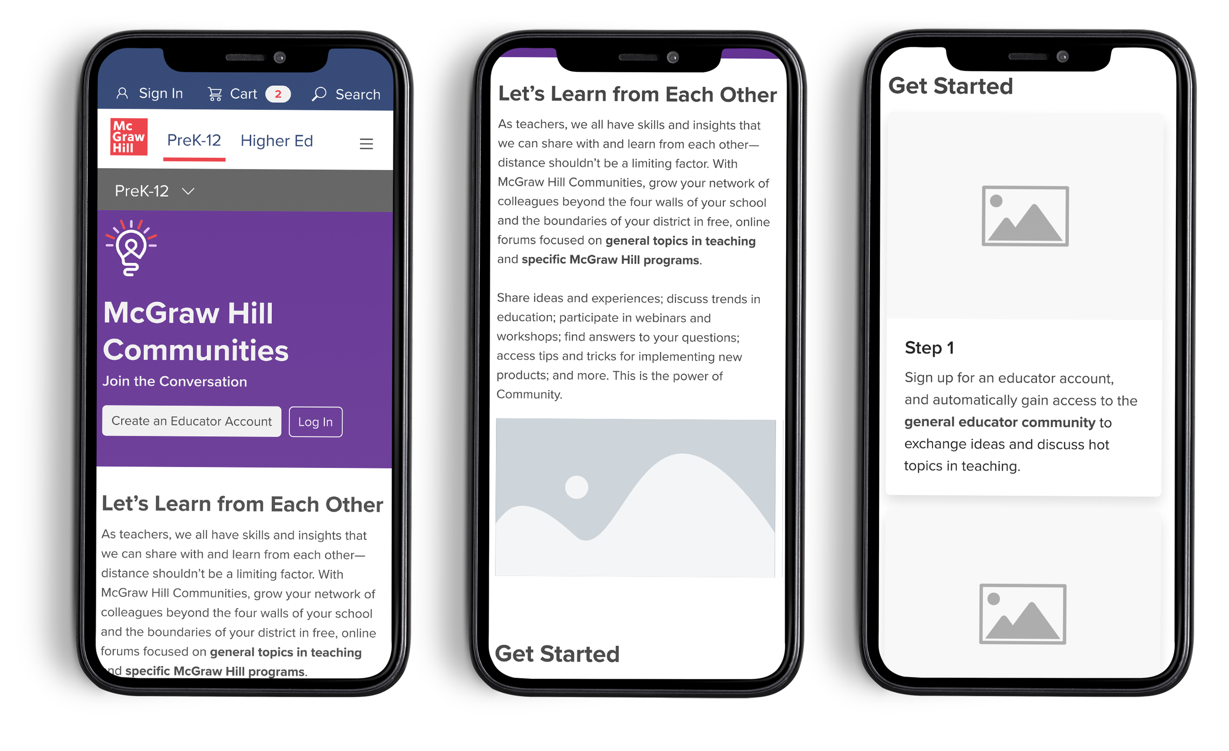
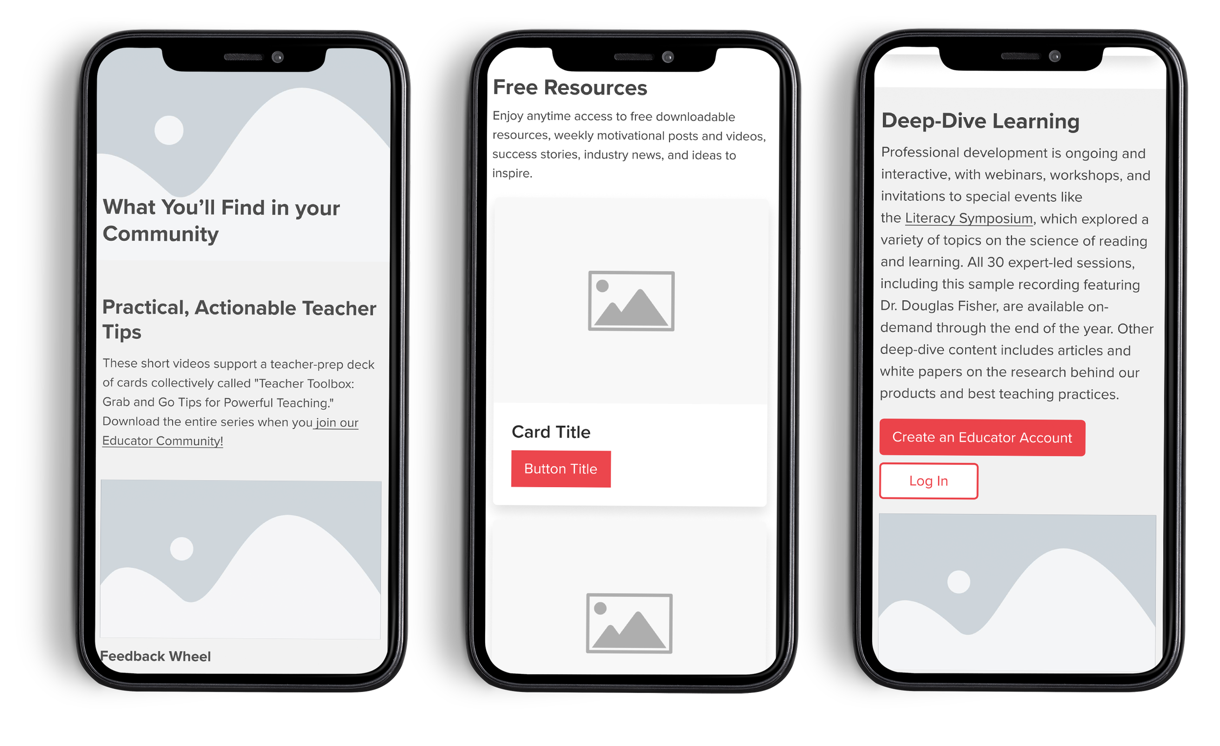
When starting out, we knew we wanted to make a simple structure that would be easy for our customers to navigate, as well as succinctly explain what Communities is, the sign up process, and what you get with an account. A key update to the single page, was to provide two clear access point areas to the platform. So, we added twp “Create an Account” and “Log In” CTA’s on the page, one at the top and one near the bottom, in case someone needed to read more before joining.

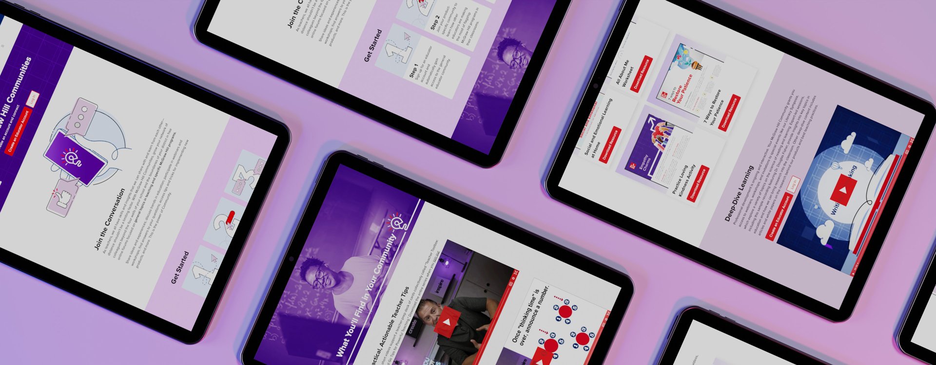
Design
When working through the design, the only existing branding for “Communities” was the logo. It was designed with a very friendly feel to it with it’s thicker line-weight and rounded stroke end caps. So, I knew I wanted to match the energy with anything I did moving forward.