
State Adoption Site Template
Role Lead Designer
Skills UX/UI, Visual Design, 3D Renders
Tools Figma, Lucidchart, Blender, Photoshop, Illustrator
Goal was to develop a cohesive and expansive site structure and design template for our state sites, that considers the unique needs of each state, while also allowing our team to do some quick turns on requests while meeting our design standard.
Often times, we have to build the plane as we fly. So, if we can set up some consistent structure that can work for most solutions, we can save a headache.
Customers at this point, aren’t super interested in reading that much about the program, since they know the state has approved it. So, how can we get them straight to the program.
Our Marketing Partners often have many downloadable resources they feel customers need access to or will need to add to the sampling experience further down the line. How do we provide these resources a space without affecting the customers experience to the sampling?
Problem Statements
Initial Work
To start off, I did a general audit of our existing state sites to figure out what information seemed like the most consistent overlap. The main overlap in content was really centered around three things: Contact a Rep, Sample Access, Key Marketing Downloads.
During my deep dive, I found some state sites didn’t have a general state landing page instead, they just dropped customers into the single subject adoption 1-2-3 sample page. Other pages hosted all the different subject adoption content on the home page. Even others had selection cards for each program that McGraw Hill bid for a state subject adoption.
Each of those experiences have some clear problems for a customer experience. Such as, no clear state specific landing page for future adoption cycles to expand on, front pages that were too much of a deep dive of content, and a lack of customer specific labeling to inform customers which program goes with which specific subject adoption.


Site Map Exploration
While not a super complex site structure, I knew how easily each state could balloon into a monster of choices without holistic planning. I knew the best way to get buy in from our partners, was the show how robust pages can get and how we can easily simplify those paths with adjustments.
So, I explored this with Alabama’s Science Adoption and South Carolina’s Math Adoption. Mainly pushing for Subject Level entry points to really clean up that landing page.

General Template Structure
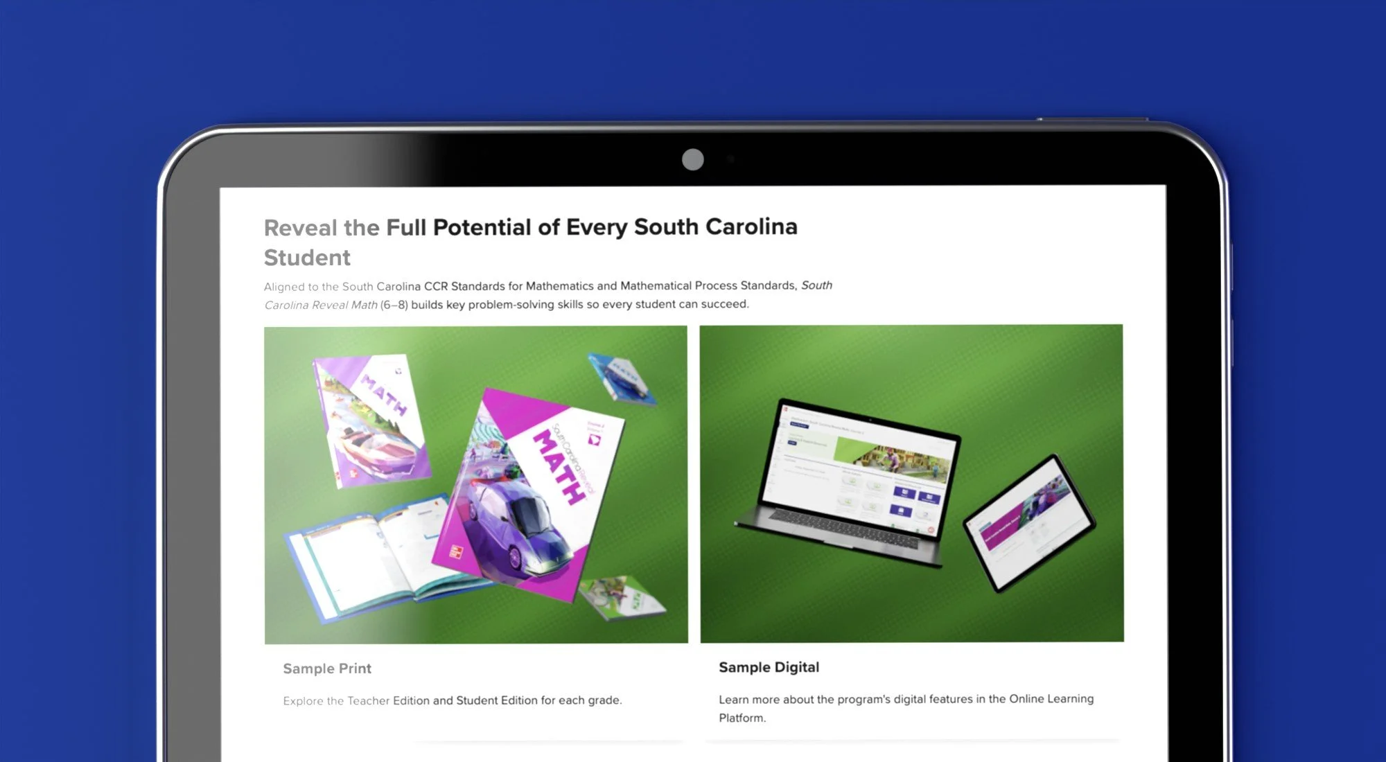
After working through some site maps, I decided to take a recent state request, South Carolina, to develop a general wireframe. South Carolina worked for this because the request seemed to represent the most “classic” example of our Adoption State Site requests. It included two general Subject Adoption’s, Math and CTE, with Science calling for a few Advanced Placement titles.
The wireframe structure would include a home page, subject landing pages, and then the sample resources page.
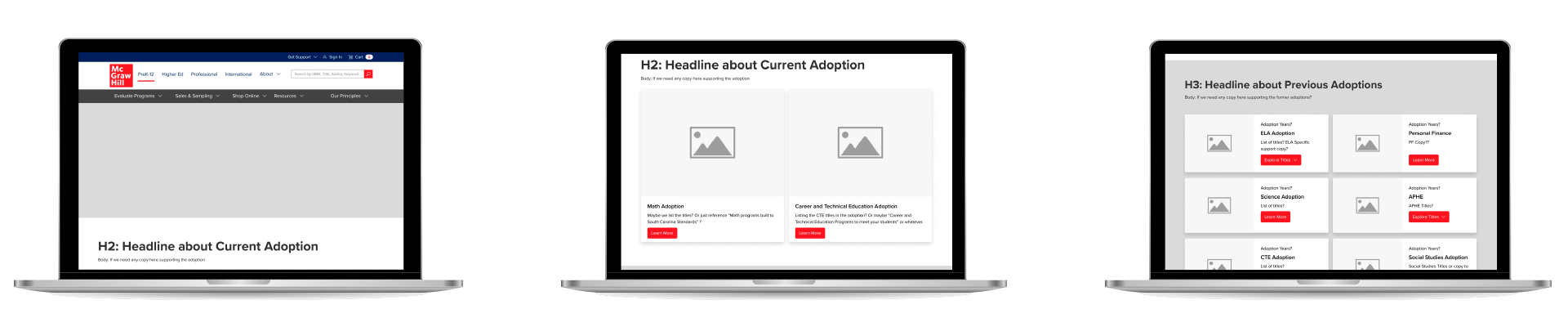
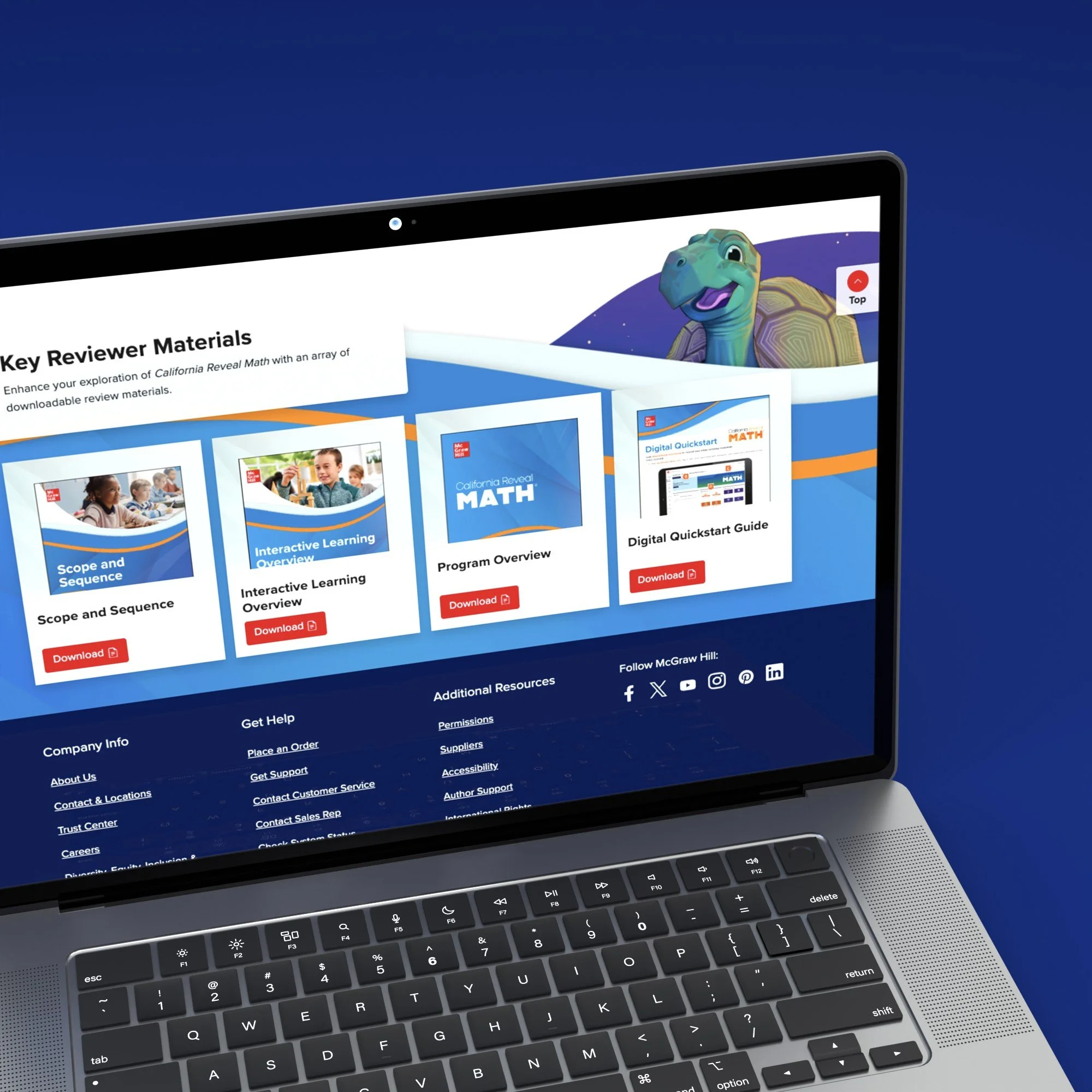
Sample Resources Page Exploration
For a few years, all of our Sample Resource pages were built with a “1-2-3” structure. It was meant to be a one-stop shop for customers to learn about the program and gain access to sampling. Some issues with them were:
The CTA’s from earlier pages to these pages are “Sample Now” but when you first arrive you don’t immediately get that experience. You’re getting introductions and an Overview Brochure they already have access to.
I just want to see product and experience it. Marketing collateral doesn’t concern me as much at this stage.
The Print Sampling Sites, something that came about because of COVID, were a lot of work for our partners with very minimal customer conversions per visitor.

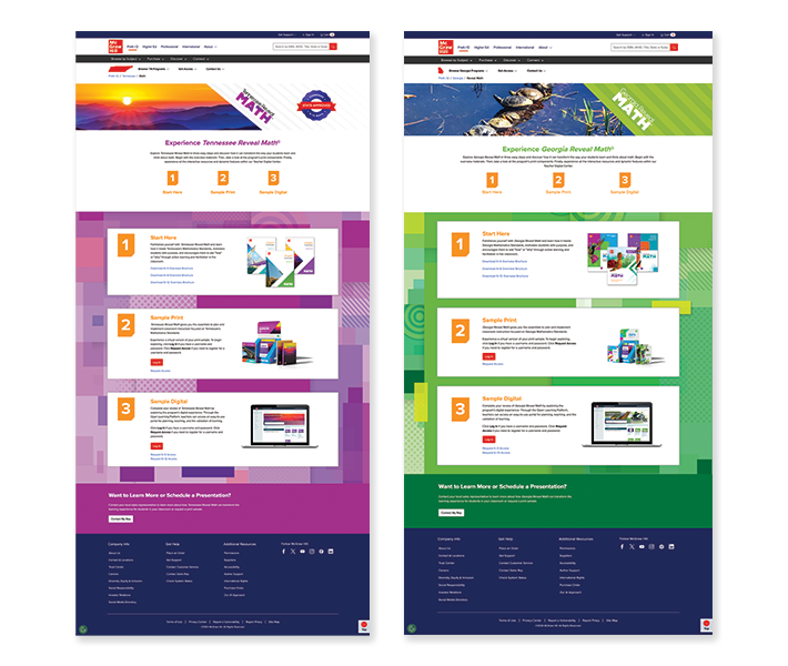
With that information in mind, I played around with a new layout, that helped get customers straight to the content they want, while still allowing our marketing partners to provide a space for key review materials that can help customers and support our sales teams in the field.
I wasn’t sure how many pieces of additional marketing material our partners would want or if they’d want to continue making Print sampling pages, so those variations were my focus.
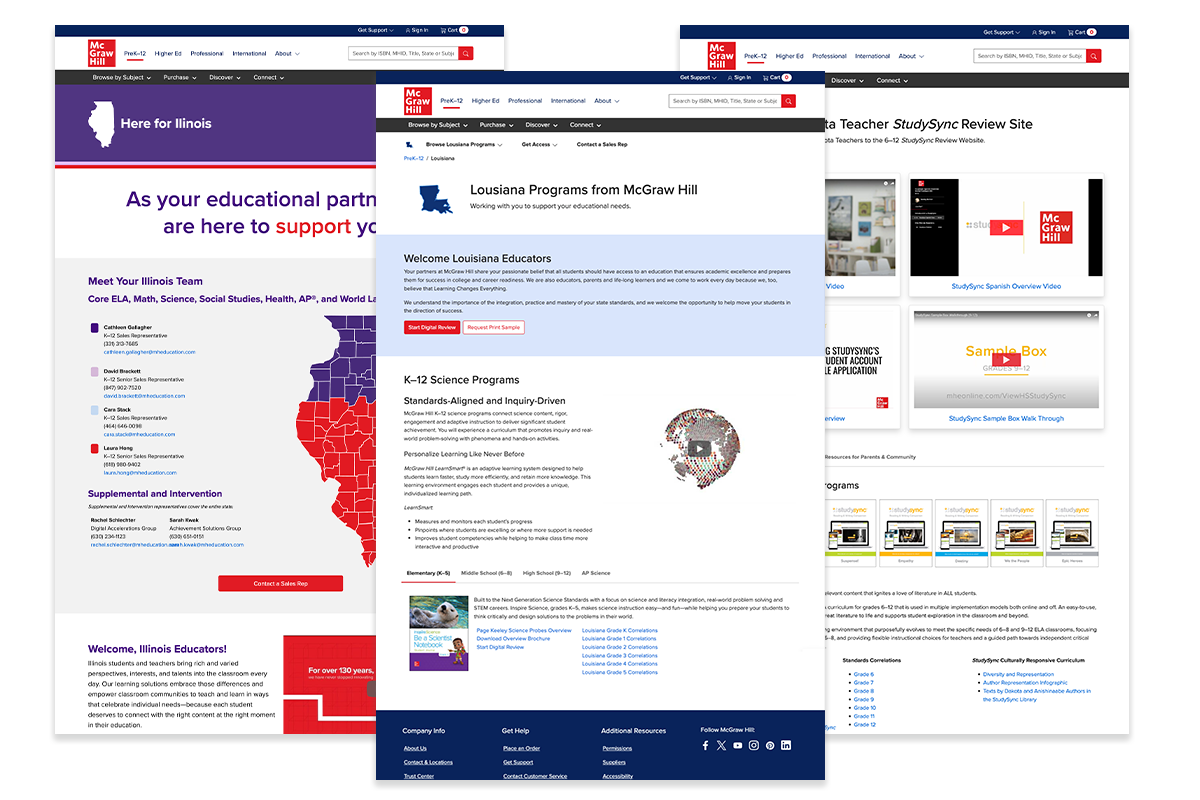
In the past, the go-to solution for quick turn’s was to slap the state shape on a graphic and then talk to the program up for adoption right away. You can see some examples to the right. This obviously, reads as low-effort and low-stakes, but also led to the lack of cohesion in style for the regional landing pages referenced previously.
So, I wanted to develop a header that could be clean, cohesive across all states, and unique for each state. This turned into a photo collage, that allows for more depth and breadth of the state to be shown and a few illustrations that will highlight some state symbols. This style
Landing Page Alignment
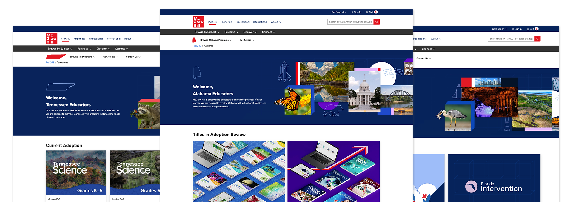
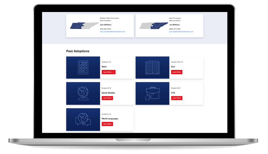
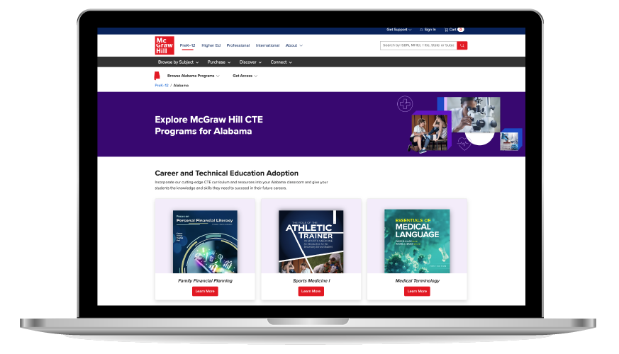
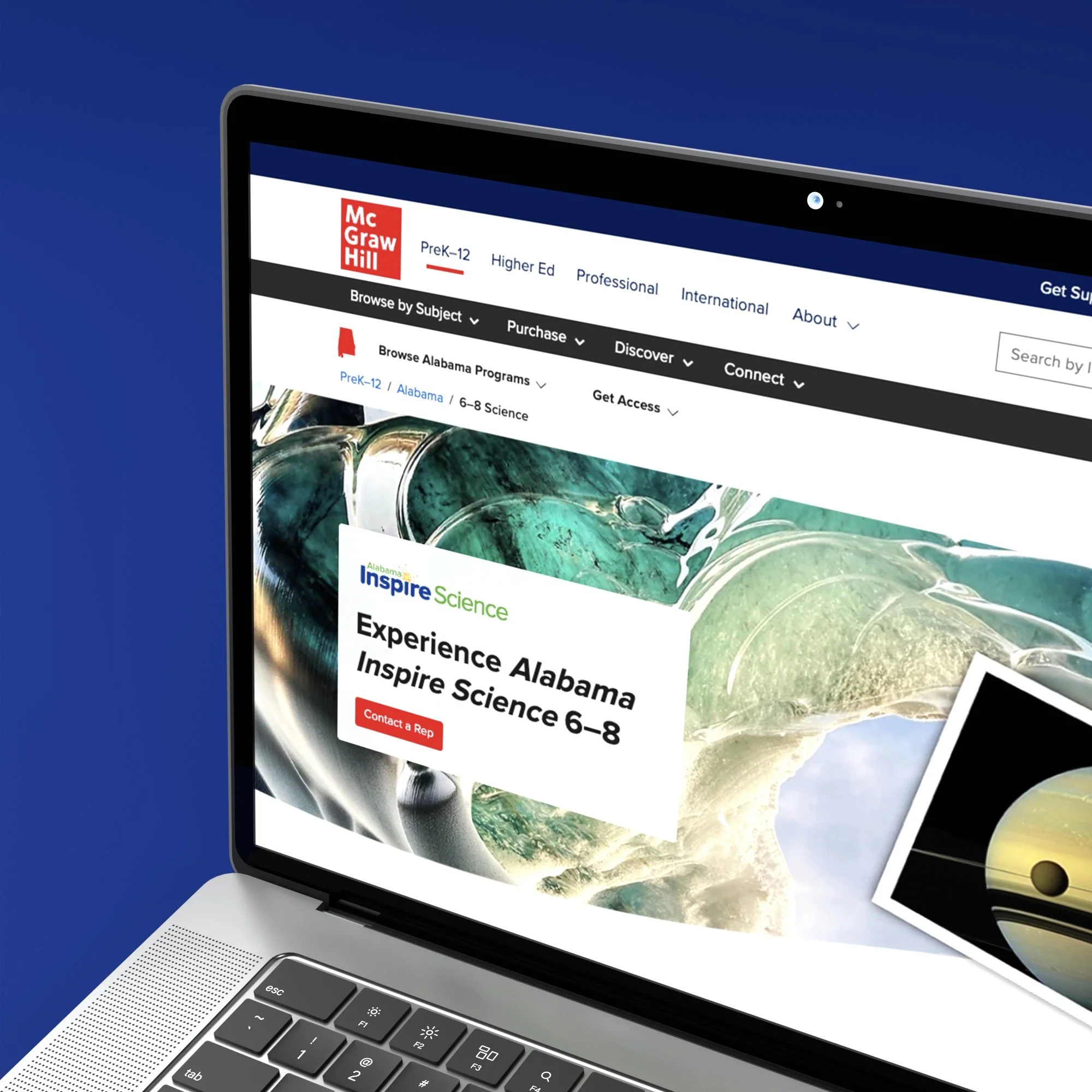
As I developed some design directions, two of my co-workers were tasked with designing the Tennessee and Alabama sites. So, they were able to use my general structure and wireframe to develop their sites. I also asked them to figure out a visual solution for the Subject Landing pages and Past Adoption’s Subject Identifiers. They did and so their decisions became a design template moving forward.
State Site’s Design


Final Design
Feel free to check out a few of the state sites I designed using this template.